Switching to MapBRB: How Field Service Companies Can Break Free from Bloated Software and Start Saving in the First Month
For too long, field service companies have been trapped in expensive, clunky, overcomplicated software contracts.
From idea to code, any product or feature should follow a simple roadmap.

When I sit down to design a new application or product feature, the first piece I start with is the user flow.
It's tempting to start with layouts and colors, but it's not the most efficient workflow. That's because it's too easy to get caught-up in the never-ending trap of colors, fonts, navbars, etc. That stuff will all matter eventually, but in the early stages, it doesn't matter.
What is a "user flow"? It helps to think about what your user wants to accomplish:
The user wants to start at X ... do a bunch of stuff, then get to Y. But everything in-between needs to be designed. Examples would be a log-in screen, or finding the best flight to New York.
The goal with a user flow is to sketch fast and illustrate the essential elements of the feature. Pen and paper. Marker and whiteboard. Whatever. Using simple tools like a pen and paper allows you and the team the speed and flexibility to get a lot of ideas into the wild quickly.
What you're creating here is going to end up in the trash can anyway, so no need to spend a ton of time making it look good. (We'll do that in the code).
User flows are really beneficial because it helps all members of the team get on the same page. And, it helps people give quick, thoughtful feedback... instead of bullshit like, "I don't like the orange you used there. Let's try green." Nothing derails a good brainstorm then some dick commenting on colors or font choice.
User flows eliminate these BS comments because the sketches are just words:
What the user sees => What the user does ===> What the user sees next => What they do next
This shorthand for creating user flows is from Ryan Singer. This guy is one of my favorite designers! Click here to read more about Ryan's shorthand for creating user flows.
We're simply describing the interaction the user needs to perform to complete a certain task (feature). When you break it down into this simple shorthand, it's easier to create really good features, because people don't get sidetracked by miscellaneous stuff. Everyone on the team can focus on interaction.
Once you get the user flow dialed, it's time to move on to wireframes.
I create wireframes a couple of different ways... One is to break out InDesign and start rolling, the second is simple sketches with pen and paper. I'll use InDesign if I need to send the wireframes to someone. But, if it's just me, I like my trusty sketchbook.
BTW, you can use Photoshop, Sketch, Figma... whatever you want. But, you're only putting gray boxes around the screen. There is ZERO need to purchase a "wireframe" tool like Balsamic. In fact, please, do not use Balsamic. The reason I don't like Balsamic is because they put too much into the wireframe. You don't need that much detail. Keep it simple.
The whole point of wireframes is to move fast. Find what works. We do not care if it looks great at this point!
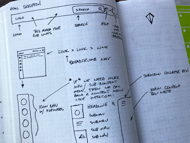
Your wireframe should look something like this:
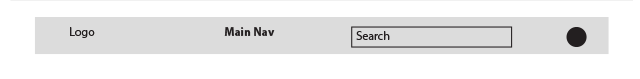
Once I get the basic wireframes looking nice, I'll put a little more detail in the mock-ups. However, I'm still in grayscale.
Why Grayscale?
First reason is because it eliminates the fing bullshit comments like: "I don't like that orange." Dude, we're not focusing on color here. We're focusing on layout and user flow.
Does the mock-up make sense? Will the user know what to do? At this point, we don't care about color or content. Just layout, and basic user interaction.
Also, by creating mocks in grayscale, it forces you to be creative with contrast and size and space. If you can nail it in grayscale, it's going to crush in color!
BTW, same thing with logos. Always design your logo in grayscale first. If your logo can't stand on it's own in black and white, you have a shitbird logo.

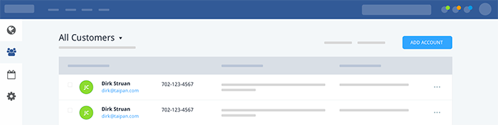
At this stage in my career, I rarely do high fidelity mocks. It's just easier to get into the code and make it happen there. However, high fidelity mocks DO serve a purpose.
The main reason I do high fidelity mocks is to get buy-in from others on the team. Often times, the design and interaction is perfectly clear in my head, but nobody else can see it. So, high fidelity mocks will help others visualize what I can already see.
Where most designers and developers get into trouble is, they design and design and design. You don't need to sketch out every single, tiny detail to get the main idea across.
Trying to design how every little feature will look is really hard, and frankly a waste of your time.
Best thing to do at this point is to jump into the code. Let's make this thing come to life. There's nothing more exciting than creating a kick-ass interface with HTML + CSS + JavaScript!
We could get into responsive design and making sure things work across viewports, but I'll have that for another post.