Switching to MapBRB: How Field Service Companies Can Break Free from Bloated Software and Start Saving in the First Month
For too long, field service companies have been trapped in expensive, clunky, overcomplicated software contracts.
Simple button design rules for better user interface and user experience design.
Here is a mistake I see developers and designers make:
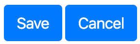
Do you see the problem?
In the example above, there is no clear representation of "what" I should do. Both buttons are the same weight. Same color. Same shape. Sure, I can read the text... but don't make me think about it.
The fix:
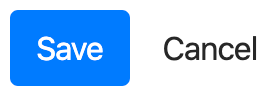
The above pattern is so damn simple, elegant and solves the problem. I love this pattern! The pattern above directs the user's eye to the "Save" button: the primary action. The "Cancel" is secondary, so should not have much emphasis.
Below is my favorite "Save or Cancel" pattern right now:
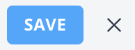
For "Save or Cancel" button pairs, choose one pattern, and use that pattern throughout your entire app. Please! It's SOOO easy. And, your users will thank you for it.
Another mistake I see a lot, is different button styles within the same app or website:
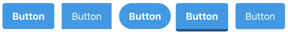
It doesn't matter what style you choose: Rounded buttons, square, full-round, 3D button, flat with drop-shadow, etc., just pick one style and stick with it!
Another mistake is having all the buttons the same weight. If you have 3 buttons on a page, please make only 1 the primary action... not all 3... or all 5... or all 10 (WTF!). When you do this, you are simply forcing your users to hate you. (Just kidding... but, seriously, don't do this).
Here is the solution:

That's it for this post. Like I said, quick and dirty. But, hopefully you can follow these simple rules for your interface. Super easy and will make your users love you.
Click here for some additional design tips for developers of SaaS applications.